HSI Platform New UI - EHS LMS SDS
The New HSI User Interface
Welcome to the new User Interface (UI) for the HSI platform, including our LMS, SDS and EHS solutions! The new UI is designed to improve navigation and make it easier for you to access the features and functionality that you need. From the updated layout to the refreshed color scheme, everything has been thoughtfully considered to enhance your overall experience.

The New "One HSI" UI
Our goal has always been to provide a seamless, intuitive and user-friendly experience to our customers, and with the new UI, we have taken that to the next level.
Why a new UI? Some of the key features of the new UI include:
- Unify the user experience for all HSI platforms into one cohesive interface
- Consolidate and synchronize identity management across platforms
- Improved navigation to make it easier to access key features
- More intuitive layout for a better user experience
- Mobile experience improvements
- Accessibility and usability improvements for assistive technology access
We are confident that you will find the new UI to be a significant improvement over our previous design, and we encourage you to log in and explore all of the new features.

Access to Our Entire Platform -- New Menu, New Navigation
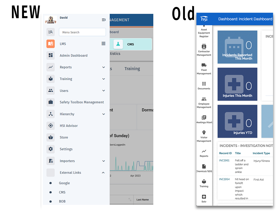
Now you can experience the power of HSI -- all solutions in a single UI, with a single login. The new HSI UI unifies the interfaces for all HSI solutions with a refreshed and modern look and feel, and easy navigation between all solutions. The goal of this change is to modernize the UI and provide a consistent user experience between all HSI properties.
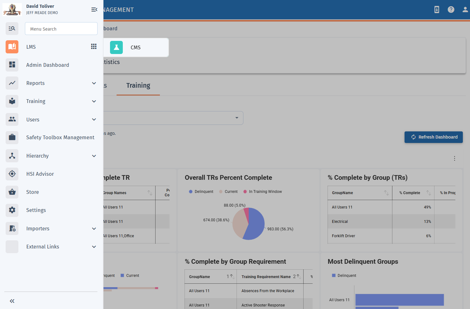
- The new menu for the new user interface allows quick access to just the one solution you have, or multiple HSI solutions in one view.
- Pop-out menu vs. constant left-hand menu gives you more space on screen and reduces clutter for users
- Quick menu items, categorized by solution or module type

The New LMS Design
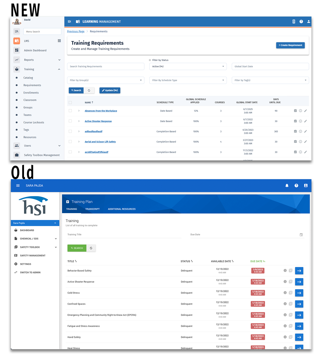
With the new UI, the HSI LMS (Learning Management System) stays at the heart of the system, but gives managers and users an easier-to-read interface, and the ability to navigate to the needed courses quicker. Additional courses can be featured right within the main view, allowing employees to gain more knowledge from the company investment.
- A clean and modern design
- At-a-glance view for managers to be able to see the status of their employees' training
- Easier search and filtering to find the courses you need
- Quicker access to required assignments, featured courses, and transcripts

The New EHS Design
The updated UI for Safety Management and EHS solutions allows you to see a seamless view across all modules, in a cleaner, easier-to-read format. We've retained our classic features and updated how you read and navigate, including:
- Improved pagination tools and updated filtering options
- Breadcrumb design for easier navigation
- Easier to follow layout for clear line of site on the most important components of a page
- Additional graphical representations for injuries and near misses
- Better layouts for mobile device viewing

The New Chemical Management/SDS UI
Chemical Management requires safety datasheets available as quickly as possible. With the new UI, we've streamlined the views and access so employees can get the datasheet they need in a streamlined fashion. The new UI represents a leap forward in finding datasheets, and updating them as needed.
- Improved site search and clarity of results to make it easy for employees to get what they need quickly
- Tabbed library to better organize the datasheets you need
- Enhanced search and filtering capabilities
- The most important information presented clearly on the homepage

New Reporting & Dashboards
What good is all the data you collect in the new platform if you can't see it? With the new UI comes new dashboards and new ways of visualizing data -- course statuses, incidents, SDS, and more, all in a single reporting interface.
- New charts allow you to see course completions by employee, department, or other type of grouping
- At-a-glance visualizations allow users to better comprehend the data presented
- View data "by location" to see where trouble spots may be
- See near misses or injuries and calculate important metrics like "days away from work"
- Build custom reports and dashboard widgets based on your business needs
- Tabbed view so you can toggle between course completions, EHS and ESG metrics, and chemical management data
